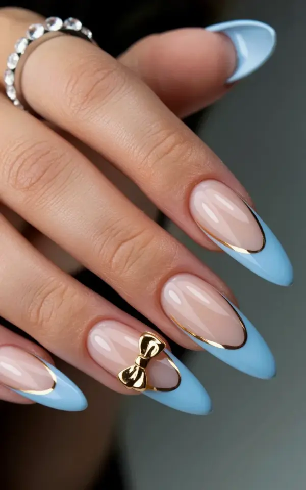
Ok so I have to talk about this specific set of stiletto nails I saw. Honestly, I was just scrolling through my feed and stopped dead. It’s the powder blue tips with the thin gold line and those tiny gold bows. Look, everyone tries to get this look. And everyone messes it up in at least one way. The nude is wrong, the blue is too loud, the bow falls off before you even leave the salon. I wanted to break down exactly what goes wrong most of the time. And how you can walk in, show the photo, and walk out with the exact set in your head.
Why Your Nude Base Might Be Ruining the Whole Look
The nude base in that photo is very specific. It’s a soft, warm beige. It is not pink. It is not peach. And it sure is not that weird chalky tan.
Here’s the thing I have a weird personal hang-up about: most salons stock one single nude. And it usually leans too cool or too yellow for your skin. If the base is too opaque, it looks like a bandaid. You lose the softness.
You need a sheer-to-medium coverage nude. Let your natural nail line peek through at the cuticle a little bit. That transparency is what makes it look natural and luxurious instead of like plastic.
If your tech pulls out a solid white-ish beige, stop her. Ask for something with a little warmth. A little blur to it. Not full coverage.
The Powder Blue Balance is Harder Than You Think
That specific blue. My god. It’s not a sky blue. It’s not a baby blue. It’s a muted, dusty powder blue.
What is powder blue exactly? Honestly, it’s a pastel that has been slightly greyed out. It sits soft on the eye. It doesn’t scream.
The biggest mistake I see is people using a bright pastel creme. Something that looks like a highlighter or a Easter egg. That clashes so badly with the nude base it actually hurts to look at.
You want a milky, almost cloudy quality to the acrylic powder or gel. Show the photo. If the color they grab looks even a little bit neon, veto it. You need that soft, gentle pop of color. Not a punch in the face.
That Thin Gold Line is an Architectural Detail
The gold stripe separating the nude from the powder blue tip? It’s the entire backbone of the design.
It cannot be thick. It cannot be chunky. It needs to be a whisper of metallic gold. A thin, precise line.
Most people default to foil. But foil tears and leaves jagged edges. Or they use the thick sticker strips which leave a huge ridge under the top coat. You feel it forever.
I prefer an ultra-fine gold striping brush and gel polish. Or a very thin strip of gold mylar. Not the wide sheets. The skinny little rolls.
- Mistake 1: Using thick foil tape. It creates a bump and ruins the smooth finish.
- Mistake 2: Placing it too high or too low. Let the nude base breathe. The gap between the cuticle and the blue tip should be generous and balanced.
- Mistake 3: Making it too thick. Thin is elegant. Thick is clunky.
Gold Bows That Look Luxe Instead of Like a Toy
Look, I love 3D nail art. But nothing breaks my heart faster than a bow that looks like a plastic Happy Meal toy glued to my nail.
The gold bows in this design are tiny. They are delicate. They are an accent, not the main event.
Common disaster: Buying the huge, chunky metal charms. They catch on your
#stiletto nails #French manicure #acrylic nail inspiration #powder blue nails #gold bow nails
Leave a Comment