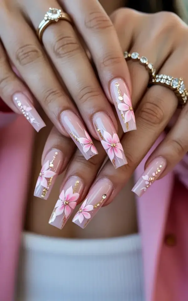
You know that exact feeling when you spot a nail design and instantly screenshot it, zoom in on every detail, and mentally rearrange your whole week around getting to the salon? That photo of pink and gold acrylic nails with delicate flower art is living in my head rent free right now. And honestly, the coffin shape with that soft pink base and those dainty floral details is the kind of manicure that makes you want to stare at your own hands all day long.
But here’s the thing. I’ve seen so many people walk into a salon with a photo like this and walk out with something that looks nothing like what they asked for. Not because the tech is bad, but because the design has a few sneaky little details that get lost in translation. So let’s talk about the common mistakes people make with this exact pink and gold coffin nail look, and how to avoid every single one of them.
The Biggest Mistake: Not Prepping Your Base Color for Flower Art
Look, I get it. You see that soft pink base in the photo and you think, “just paint it pink, easy.” But that soft pink is doing a lot of heavy lifting. The flowers on each nail are positioned dead center, which means every imperfection in the base coat shows up like a neon sign.
The mistake most people make is letting the salon pick a random pink polish without testing it against their skin tone first. That milky pink in the photo can pull too warm or too cool depending on your undertone. And if the base is too opaque, those delicate pink flowers just blend right into it and disappear.
Ask your tech for a sheer jelly pink or a milky pink that lets a hint of natural nail show through. The flowers need contrast to pop, otherwise you end up with a blob of pink on pink that looks like a mistake instead of a masterpiece.
Flower Placement: Why Center Placement Is Tricky for Coffin Nails
Those flowers in the photo are sitting right in the middle of each nail, and that placement is a lot harder to pull off than it looks. Coffin nails have that narrow tip, so the middle of the nail is actually a moving target depending on the length and taper of your own nails.
Here’s a mistake I see constantly: the flower gets placed too high near the cuticle or too low near the tip, throwing off the whole balance of the design. On a 3 to 4 inch coffin nail, the center is actually lower than you think, closer to the midpoint of the nail bed than the actual geometric center of the whole nail.
Tell your tech to mark the center point with a tiny dot of gel before starting the flowers. It sounds extra, but it keeps every nail consistent. And if one flower ends up slightly off center, honestly, it’s fine. Hand-painted designs are supposed to look a little organic. But if all five flowers are in different positions, that’s when it starts to look sloppy.
The Gold Glitter Mistake: Too Much or Too Little
That shimmering effect in the photo comes from gold glitter that’s carefully placed, not dumped on. I have seen so many attempts at this design where the gold accents end up looking like a craft project gone wrong.
The trick is to keep the gold as an accent, not a main character. In the photo, the glitter is scattered across the nails and paired with tiny gold rhinestones, but there’s still plenty of negative space. The pink flowers stay the focal point, and the gold just adds that little sparkle when the light hits your hand.
If you want the exact look from the photo, give your tech these specifics:
- Use a fine gold glitter, not chunky glitter pieces, for the scattered effect
- Place the rhinestones asymmetrically, not in a straight line down the nail
- Keep the gold concentrated around the flower petals, not spread evenly across the whole nail
- Ask for a matte top coat over the pink base, then add the glitter on top for dimension
That last one is a pro secret, by the way. Glitter over a matte base catches the light way better than glitter over a glossy base. It gives you that scattered light effect that makes the whole design look expensive instead of just sparkly.
Losing the Design in the Shape: Coffin Nail Proportions
Ok so here’s a mistake that literally changes the whole look: getting the coffin shape wrong. The nails in the photo are long and sculpted, 3 to 4 inches, and that length is why the flowers fit so perfectly in the center. Short coffin nails with a big flower design just look crowded.
The coffin shape needs a specific balance, not too tapered at the tip and not too wide at the base. If the sides are filed too aggressively, the nail looks more like a stiletto, and the flower placement gets awkward. If the tip is too wide, it looks like a broken square, and the whole design loses that elegant feel.
When you’re at the salon, be specific. Say you want a true coffin with a narrow, flat tip and straight sides that taper gently from the base. And don’t let your tech talk you into a shorter length if you want to match the photo, the flowers need that canvas to breathe. I learned this one the hard way, I went shorter thinking it would be more practical and ended up with flowers that looked like they were squeezed onto the nail like an afterthought.
Maintenance Mistakes That Ruin the Look in Week One
Alright, let’s talk about what happens after you leave the salon, because this is where the design actually lives or dies. Gold rhinestones are notorious for falling off, and the glitter detail around them can wear away fast if you’re rough on your hands.
The biggest mistake is using your nails as tools. Every time you pop a soda can or peel off a sticker, those tiny rhinestones are getting snagged. I’m not saying you need to live like a princess with no function, but you should definitely switch to the pads of your fingers for things like buttons, zippers, and laptop keys.
Another thing nobody warns you about: cuticle oil. Yes, you need it for your nail health, but too much oil can loosen the adhesive on those rhinestones. Apply your cuticle oil and let it soak in for a few minutes before you go about your day. Don’t slather on lotion and immediately start typing, that’s how you lose a stone within 24 hours.
Not Communicating the Real Details of the Photo
Here’s the thing people forget: the photo you’re referencing is a real manicure with real maintenance, real lighting, and a real ring that takes up half the attention. The ring in the photo is gold and diamond-encrusted, and it’s doing a lot of heavy lifting for the overall aesthetic. When you show your tech the photo, make sure they know you want the nails, not the whole vibe.
Shade matching is another communication fail. That pink in the photo is specific, it’s a soft, slightly muted pink with a hint of warmth. It’s not bubblegum, it’s not hot pink, and it’s definitely not nude. If you can’t describe the shade to your tech, point to the pink in the photo and say “I want this exact tone, nothing lighter, nothing brighter.”
And please, have the photo ready in a format you can actually zoom into. I can’t tell you how many times I’ve seen someone squinting at their phone, trying to show the flower detail on a photo that’s half-res and too dark to see anything. Save the screenshot, zoom into the flower center, and show your tech exactly how the petals are layered and where the gold accents are positioned.
When You Should Just Accept It Won’t Be Exact
Honestly? This design is one of those looks where asking for “exactly like the photo” sets you up for disappointment. Hand-painted flower nail art is just that, hand-painted. No two nails will be identical, and no two salon visits will produce the same design. The flowers in the photo were done by a specific artist with a specific brush stroke.
The mistake here is thinking that a different nail tech can or should replicate it perfectly. Instead, ask for the same elements: a soft pink base, flower art in the center, gold glitter accents, and coffin shape. Let the tech do their interpretation. Sometimes you get a design that’s actually better than the original because your tech adds their own little twist.
I’ve had designs where the flowers came out bigger than the photo and honestly looked better with my nail shape. I’ve also had one attempt where the gold glitter completely overwhelmed the flowers, and I had to ask for a redo. Know the difference between a design interpretation and a design problem, and don’t be afraid to speak up if something looks wrong.
The Real Secret: Confidence and a Good Top Coat
People always ask me what makes a nail design look so expensive, and honestly, it’s the top coat. That glossy finish that makes the pink base look juicy and the gold glitter look wet? That’s a quality top coat, and not all salons use a good one. Ask for a high-shine, no-wipe top coat and watch the whole design level up.
The other secret is wearing it like you meant it. I have a whole collection of nail photos I’ve never worn because I was too shy to rock something so glam. And every time I bit the bullet and tried the bold design anyway, I got more compliments in one week than I did in months of nude nails.
So if you’re eyeing this pink and gold coffin nail look, go for it. Show your tech the photo, talk through the placement, and don’t skip the rhinestones. That sparkle is the whole point. The gold diamond ring in the photo helps sell the look, but honestly, once these nails are on your hand, the ring is just a supporting actor.
Do it. Book the appointment. Bring the photo. And when you get compliments, just say thanks and flex a little. It’s your nail moment, own it.
Leave a Comment